Poster Design | H5 Mobile Webpage | Banner | User Interface | Wireframe | Animation
HongMall is a Chinese-Canadian e-commerce platform and one of North America's largest shopping apps for Asian products.
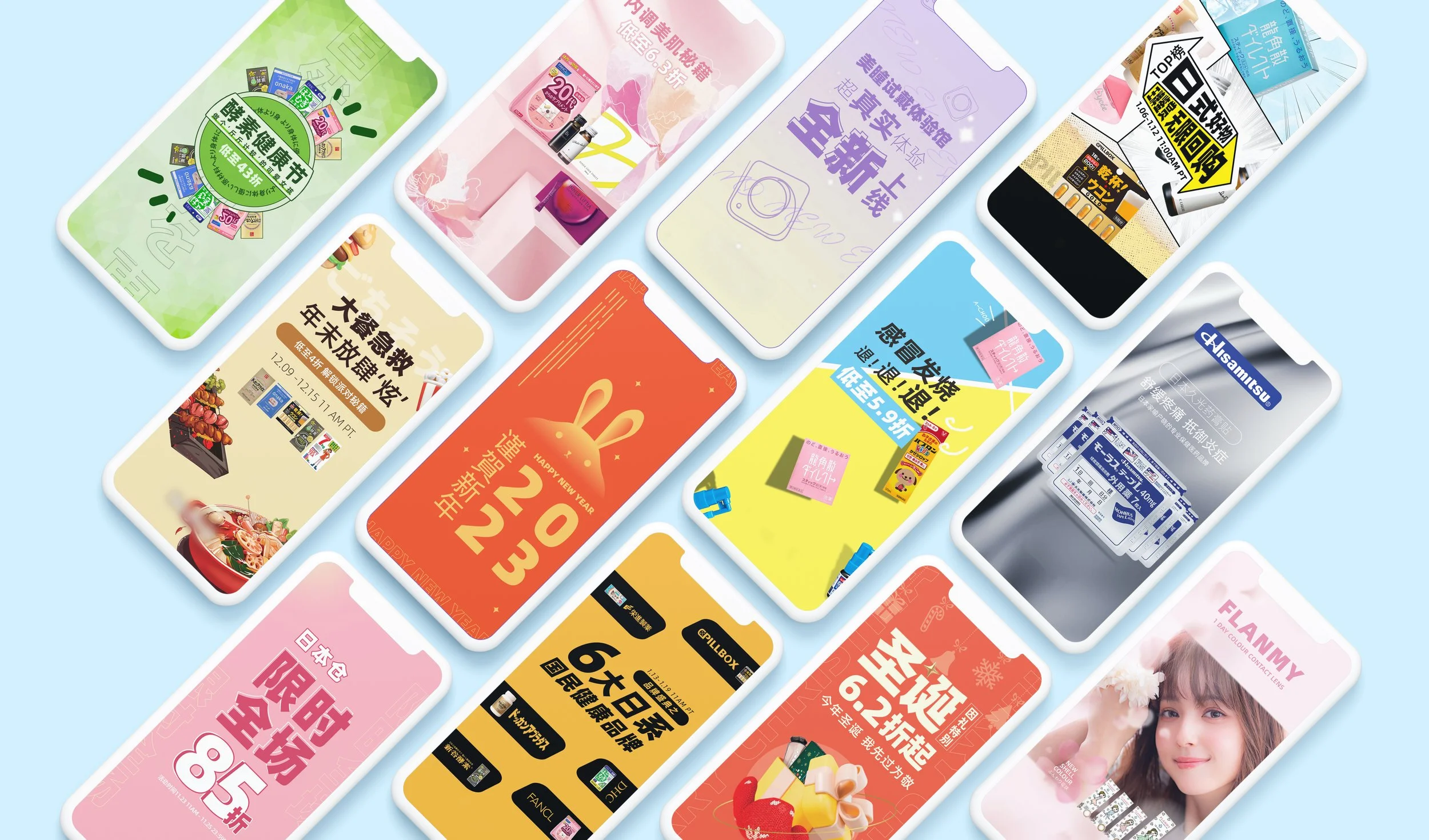
During my time at HongMall, I was responsible for creating eye-catching promotional banners to showcase new products and special deals. This required a deep understanding of the brand's visual identity, ensuring that my designs aligned with the overall image and messaging of the brand. These banners were primarily used within the mobile app.
As an in-house designer, I also created and maintained H5 mobile web pages, which are optimized for mobile devices. This involved designing layouts, graphics, and visual elements that ensure ease of navigation and readability across various mobile platforms. Additionally, I updated webpage templates to maintain consistency throughout the app.
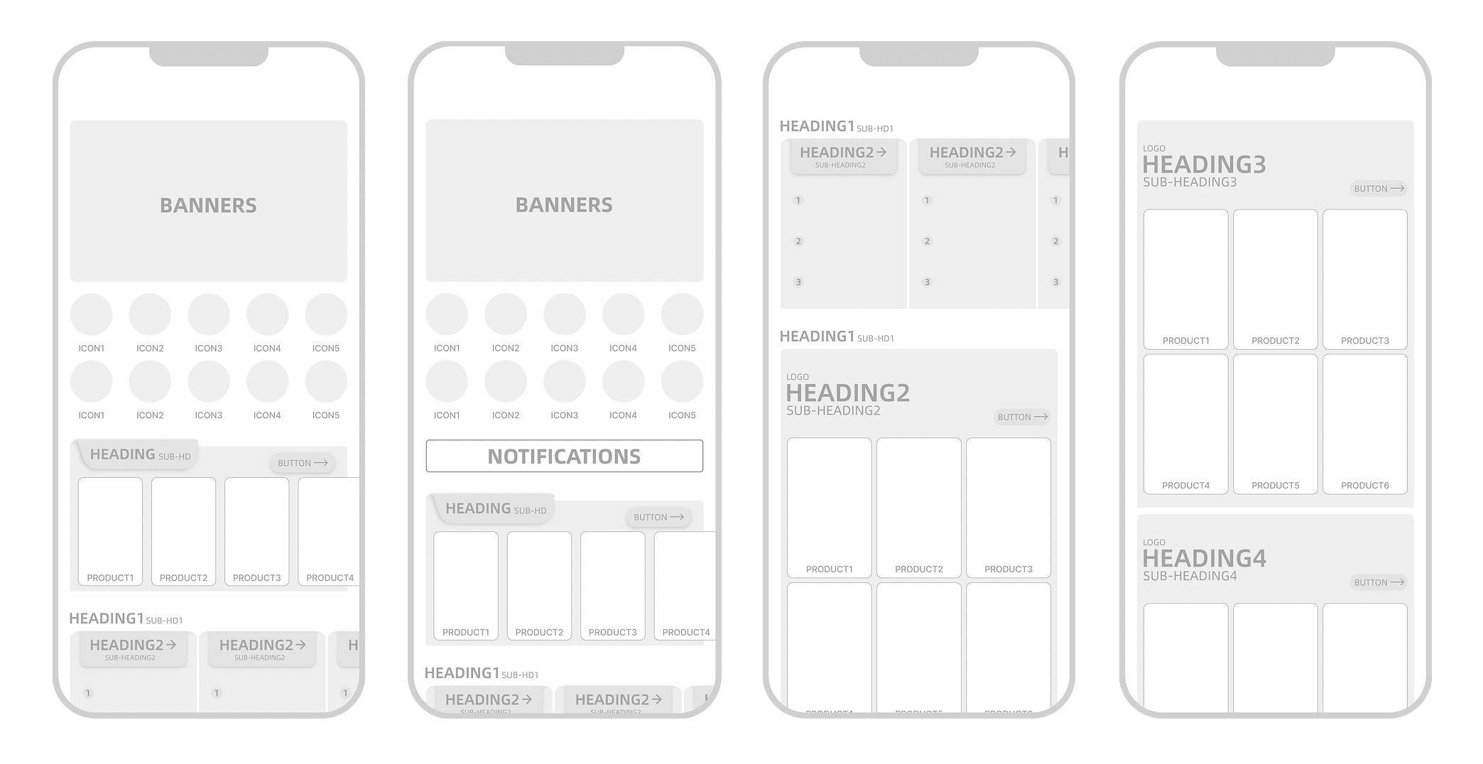
Another key aspect of my role included designing the user interface (UI) for specific sections of the app. This involved creating menus, buttons, and other interactive elements. I utilized tools like Figma and Illustrator to develop wireframes and prototypes, allowing me to test and refine the designs before the official launch.
Created With
H5 Mobile Webpages & Product Promo Posters
H5 refers to a type of mobile webpage design optimized for mobile devices. As a Graphic Designer at HongMall, I am tasked with creating various H5 mobile webpages based on the weekly themes provided by the operations team. These themes typically correspond to different groups of products.
Below are samples of H5 mobile web pages I have designed and launched in the past. Promotional events usually consist of an H5 mobile webpage, a banner (often in various sizes), and mobile-sized posters. Depending on the promotion, these events can last from one to two weeks.
New Years Special UI
As the sole designer for this section of the platform, I am responsible for designing and updating the user interface (UI) to celebrate the Lunar New Year, a significant holiday in many Asian cultures. Given that this platform primarily promotes Japanese products, it is essential for me to integrate Japanese elements into the UI design to ensure relevance and appeal to the target audience.
For instance, the homepage UI icons feature traditional Japanese symbols, including a hand-held fan, plum blossom, daruma doll, koi fish, and torii gate, all inspired by customs associated with the Japanese New Year.
By incorporating these elements into the design, I have enhanced the platform's branding and made it more engaging for its audience.
Post-Launch Issues
The overall color palette is too dense, and there needs to be greater contrast between the titles and the background color to improve readability. Additionally, the UI theme appears to be tailored specifically for the Lunar New Year, which may limit its usability beyond this holiday.
To enhance the design, it’s essential to create a more consistent and "refreshing" aesthetic that can resonate with users throughout the year.
Identifying UI Post-Launch Problems
After identifying post-launch issues, I was tasked with refining the UI to ensure usability during non-promotional periods, as specific promotional themes will require new designs. Based on click data from the New Year sales, the marketing team decided to add another row of five homepage icons, which I included in the updated wireframe.
To maintain consistency, the basic parent structure aligned with the previous UI framework, while I redesigned the individual components.
Solution to UI Post-Launch Problems (Part 1: Color Palette)
I adopted a minimalistic color palette to create a clean, consistent aesthetic aligned with HongMall's design guidelines. By keeping colors within a similar RGB range close to white, I established a clear hierarchy that simplifies navigation and content understanding.
This approach reduces visual clutter, allowing users to focus on the deals without distraction. The cohesive color scheme ensures harmony throughout the design, while specific colors for certain elements enhance comprehension. For example, a bolder color for the call-to-action button effectively draws attention and encourages user interaction.
Solution to UI Post-Launch Problems (Part 2: UI Re-Design)
The re-designed UI focuses on consistent sizing and spacing to create a harmonious and cohesive look. I incorporated rounded corners for elements like icons and headers, which help guide the eye more effectively.
The theme is designed for everyday use, prioritizing simplicity, usability, and accessibility. This ensures users can easily navigate and interact with the interface.
Maintaining consistent spacing and sizing creates visual rhythm and balance, enhancing user understanding and engagement. The rounded corners align with natural eye movement, making it easier for users to scan and absorb information.
Navigation Tab Revamp
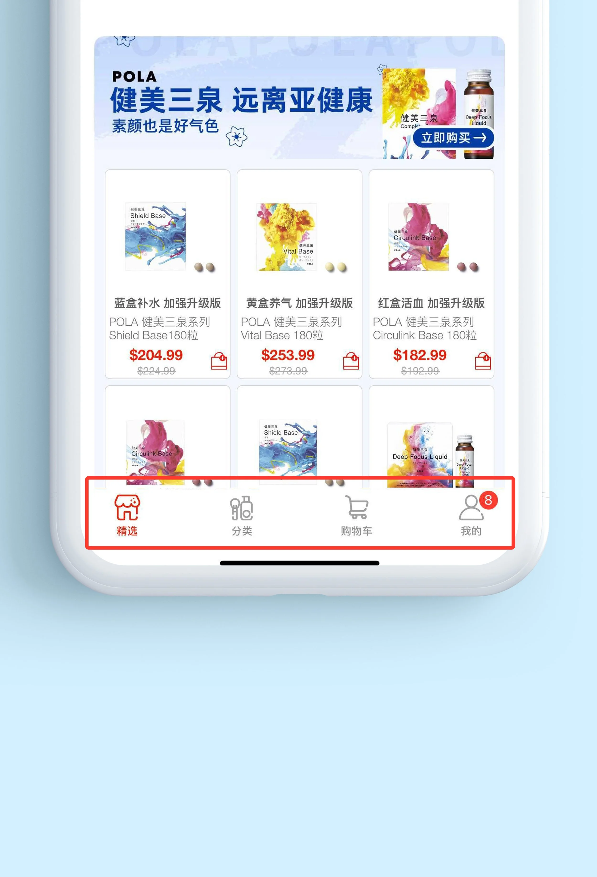
In my leisure time, I undertook a revamp of the navigation tab for the HongMall e-commerce platform, creating my own redesign based on the current tab design.
Current Tab Problems
The spacing between the white top margin and the icons is too narrow.
The icon names are too small when combined with the icons.
The overall design lacks an engaging and interactive feel.
In this redesign, I created a new set of tab icons based on the original design, adjusting the icon colors to HongMall's signature red for contrast against a minimalistic homepage. I incorporated rounded corners to maintain consistency with the overall UI theme.
To improve spacing, I reduced horizontal gaps between icons and widened the top and bottom margins for a cleaner look. I also separated the icons and titles to maximize the size of each tab button when selected.
To enhance interactivity, I added a bouncy tab bar beneath each icon during transitions, making navigation more engaging. Additionally, I designed the standby icons in grey, which switch to red when pressed or clicked, further increasing interactivity.
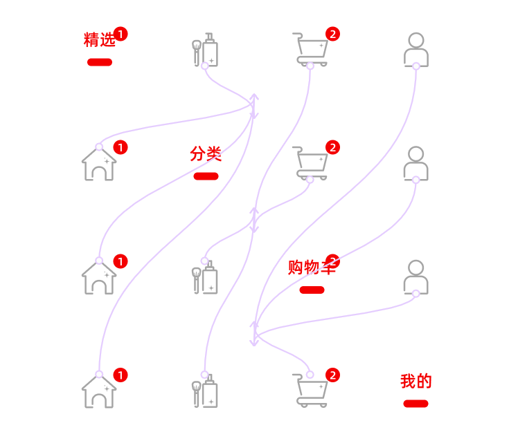
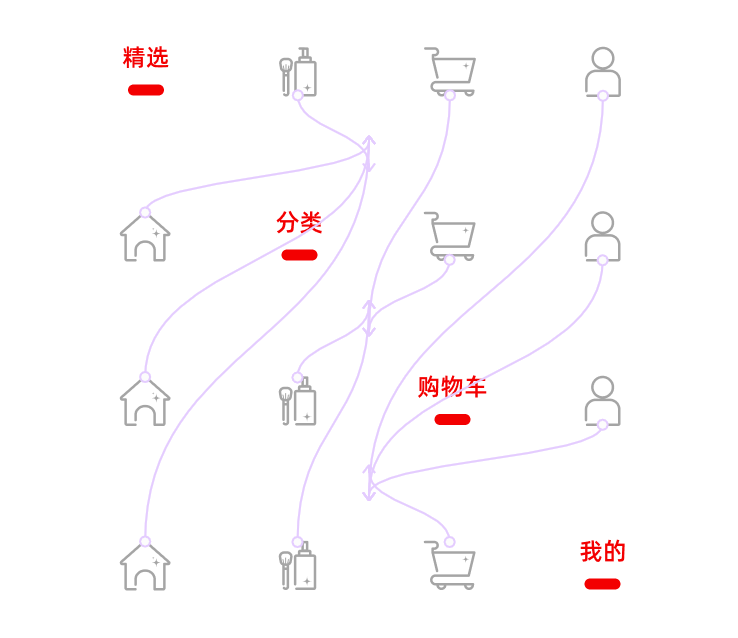
The images below showcase the final revamp of the navigation tab, along with a preview of how notifications will appear in the menu.


